Role
Product Designer
2025
Scope
Desktop app
Library and playlist workflows
Logo

Windows, macOS, and Linux
Music curation built around library metadata
Designed within technical constraints
Phoniq is a native desktop music player built in Rust by a solo developer. The application was functional, and its founder used it daily. Ahead of launch, he wanted a more cohesive interface and a logo for the product.
I worked directly with the founder on the desktop app’s structure, visual design, and supporting workflows.
The core experience centred on a music library with six attributes: title, album, genre, tags, BPM, and duration. Alongside playback, users could access playlists, favourites, recently played tracks, and tag-based browsing.
A key feature was the smart playlist creator, which used tags to curate selections without requiring users to add every track individually. That made organising the library an essential part of the listening workflow.

Create a cohesive experience around an existing product.
The redesign needed to give the application a clear visual hierarchy while respecting its existing functionality. Navigation, library browsing, editing, and playback had to feel like parts of the same system.
Work within a limited styling toolkit.
The existing UI implementation supported text colour, background colour with transparency, rounded borders, and shadows. The design needed to work within those capabilities and remain manageable for a solo developer.
Keep a dense library readable.
Six attributes per track made the table useful, but also demanding to scan. The interface needed to preserve that information while making titles, metadata, selection, and playback states easy to distinguish.
Support the work behind smart playlists.
Tag-based curation depends on useful, maintained metadata. Finding and editing tags therefore needed as much attention as creating the playlists themselves.
I began with two wireframe options exploring different navigation layouts. This gave the founder a way to compare the structure before we moved into detailed visual design.
The selected direction placed the library table at the centre, supported by persistent playback controls and sidebar navigation. Filters for BPM, genre, and duration provided additional ways to narrow a large collection.
I developed a light visual direction using the styling capabilities available in the app. Spacing, contrast, typography, and consistent component treatment established hierarchy across the information-heavy screens.
I also focused on the connection between song details, editing, and smart playlists. These were related steps in the same workflow: organising tracks so the product could use that information to create relevant selections.


DECISION 1: Establish the technical boundaries early
I worked within the styling capabilities of the existing implementation from the start.
This gave the visual design a practical foundation. Components and states could be discussed with the founder in terms of how they would work in the application, with polish coming from consistent use of the available controls.
DECISION 2: Resolve navigation before refining the visuals
I explored two wireframe directions before developing the final UI.
Although the initial request focused on appearance, the navigation shaped how users would move between the library, playlists, favourites, and recently played tracks. Comparing layouts early helped establish the structure for the detailed design.
DECISION 3: Make the library table the primary workspace
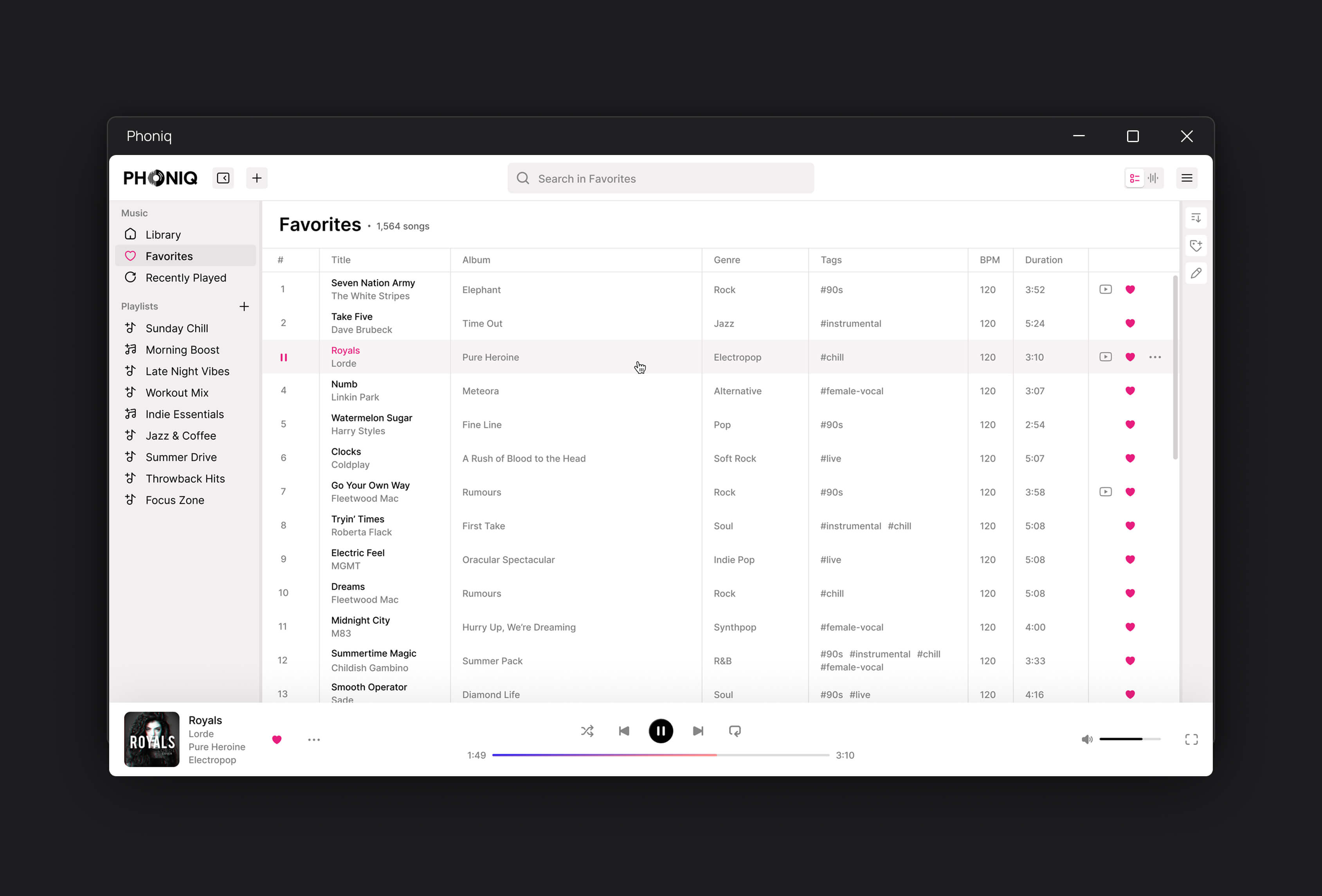
I kept all six track attributes visible in the core library view and used alignment, spacing, and text hierarchy to organise them.
This supported the product’s browsing workflow: comparing tracks by their metadata, narrowing a selection, and choosing what to play. Persistent playback controls kept the current track accessible while users explored the library.
DECISION 4: Treat tagging as part of playlist creation
I gave particular attention to song detail and editing views because tags supplied the information behind smart playlists.
The design connected those supporting tasks to the broader curation workflow. Users needed a clear way to inspect and maintain the metadata that their playlist selections depended on.

A. The library
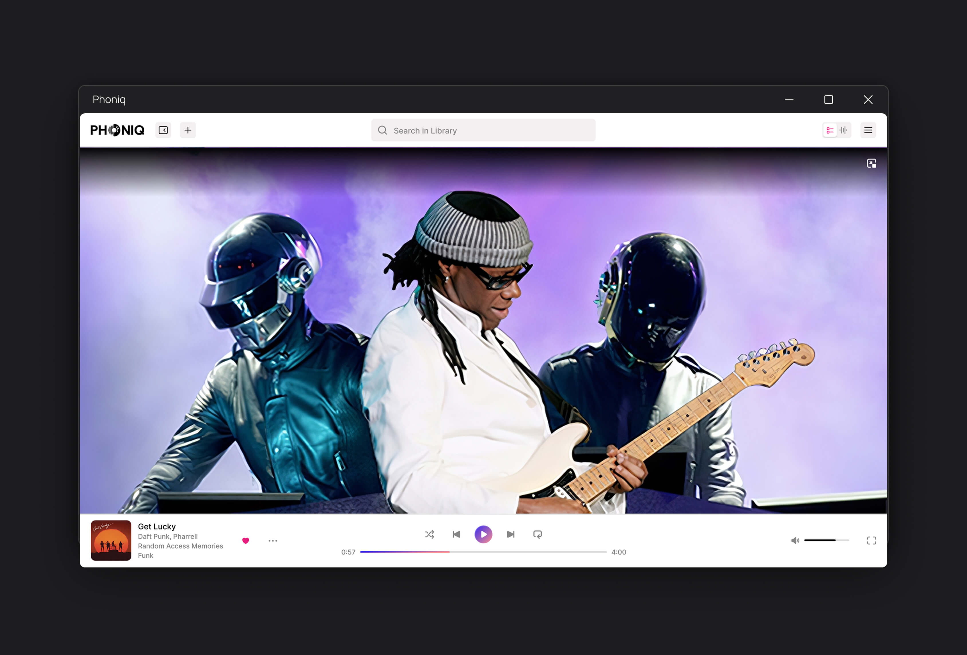
The main desktop interface brought together the six-column library, sidebar navigation, persistent player, and integrated video.
The design established a consistent hierarchy for track information, browsing controls, and playback states.

B. Filters and browsing
The filter panel supported narrowing the library by BPM, genre, and duration. Tag-based browsing offered another route through the collection, alongside favourites, recently played tracks, and playlists.


C. Song details, editing, and smart playlists
I designed the detail and edit views for reviewing track information and maintaining tags, together with the smart playlist creator that used those tags to curate selections.


D. Logo
I designed a logo to accompany the desktop interface and give Phoniq a recognisable product identity.

The project delivered a cohesive desktop interface and a logo for Phoniq. The design covered library browsing, playback, metadata editing, and playlist creation within the capabilities of the existing UI implementation.
What I delivered:
Two wireframe options exploring navigation structure.
Desktop UI covering the library, favourites, recently played tracks, playlists, and tag-based browsing.
Song detail, editing, filtering, and smart playlist creation views.
A logo for the product.
A complete Figma file with consistent typography, spacing, colours, and hover states.